How do I choose a good header photo
Large slide: The website has a large photo slider that takes up almost the entire space above the fold. The fold is the point on the homepage after which the content is no longer visible. This principle was already applied when printing newspapers. The most important message must be above the fold to attract the customer's attention. Therefore, there is room for a message, call to action button, and a registration form.
Image: Choosing the right image is important, but the image should not attract attention. It should be about the message and the call to action. Therefore, preferably choose a background photo.
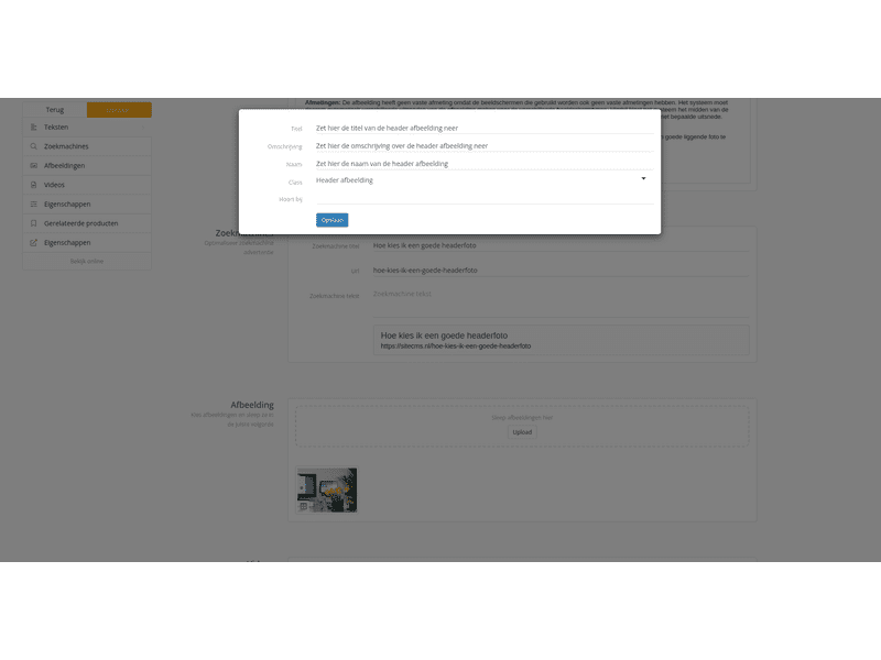
Dimensions: The image has no fixed dimensions because the screens used also have no fixed dimensions. The system must therefore automatically make different crops of the image for the different screen types. The system chooses the center of the image as the center point. If the subject of your photo is not in the center of the image, this can cause problems with certain crops. If this is the case, you can crop the image yourself so that the subject is more centered.
Landscape image: The image is landscape on desktop and portrait on mobile. Unfortunately, it is difficult to make a good landscape photo from a portrait photo. Therefore, preferably choose a landscape photo. The ideal ratio for the image is 16:9.


