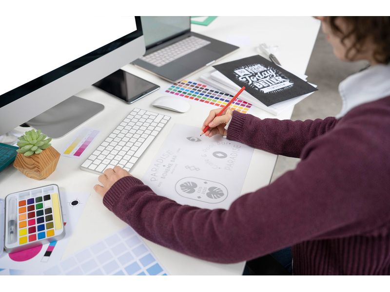
Tips for delivering a good logo
Do you want to set up a website? It doesn't matter if you want to create a dating site, a job site, a business website, or a marketplace. In all cases, you need a good logo. A logo that is placed at the top of a website must meet a number of requirements. In this article, we give you 6 tips for a good logo.
6 tips for a good logo
Tip 1: Logo in 3:1 ratio
We use your logo for the header of your website. Therefore, the logo must be much wider than it is tall. Use a 3:1 ratio. Then you can be sure that your logo always looks good in the header of the website.
Tip 2: Logo file formats
Nowadays, websites are viewed in many browsers. Not every browser can handle all formats well. Therefore, we need different file formats of your logo. Provide the following file formats.
SVG logo: This vector file of your logo will be displayed razor-sharp on all modern browsers. Make sure the SVG logo has a transparent background. Do not use a white background. This limits us in the design possibilities of your website.
PNG logo: Older browsers and email programs cannot handle SVG logos. Therefore, we also like to receive a PNG version of your logo. We prefer to receive this logo with a transparent background. The minimum size of this logo should be 750 x 250 pixels. With this size, your logo will be displayed sharply on any device.
JPG logo: The administration system of your website cannot handle the PNG file format well. Therefore, we also like to receive a JPG version of your logo. This logo should have a white background. The minimum size of your JPG logo should be 750 x 250 pixels. With this size, your logo will be displayed sharply on any device.
Tip 3: Use of color in the logo
We recommend using a logo with two colors. A primary and a secondary color. We can process these two colors well in your website. This makes your website look cohesive.
Tip 4: Incorporate company name in the logo
You are probably going to have a new website made. Therefore, always incorporate your company name in the logo. Your logo will be placed at the top left of your website. By incorporating the company name in your logo, everyone immediately sees that they have the right website in front of them. But companies like Nike and Apple also don't use a company name in the logo? That's right. They have built up enough brand value. Everyone immediately associates the logo with the company behind it. But this requires time and a lot of marketing budget.
Tip 5: Use a logo mark
For recognizability, you can incorporate a logo mark in your logo. Always position this logo mark to the left of your company name.
Tip 6: Keep the logo simple
A simple logo is easy to maintain. Therefore, it quickly ensures recognizability. In addition, a simple logo exudes professionalism. A simple logo looks calm at the top of your website. It stands out, but is not too dominant.
Want to have your own logo made?
Would you rather have your logo made based on our tips for a good logo? That's possible. With us, you can have a good logo made. Order your logo online at SiteCMS.nl and our designers will get to work for you immediately.


